A friend of ours manages organ donation registrations for a state government agency. A few years ago, his state changed the way the question appeared on the driver’s license application. They didn’t add new information. They didn’t run an awareness campaign. They didn’t hire anyone. They changed one thing: instead of asking people to opt in to organ donation, they made organ donation the default and asked people to opt out if they didn’t want to participate.
Registrations increased by over 30 percent in the first year.
The people filling out the form were the same people. The information available to them was the same. The only thing that changed was which box was already checked when they saw the form. That single design decision moved tens of thousands of people from “I’ll get around to it” to “done.”
This principle applies directly to your church’s giving page. And it takes less than five minutes to implement.
The power of the pre-selected option
Every form you’ve ever filled out online has defaults. When you sign up for a new account, the newsletter checkbox is usually pre-checked. When you buy something online, the shipping method defaults to standard. When you set up a streaming service, autoplay is on.
These aren’t accidents. They’re design decisions. And they’re based on decades of research showing that most people accept the default option on any form, regardless of their preferences. Not because they’re passive or uninformed. Because defaults signal a recommendation. They communicate: this is the normal thing to do. This is what most people choose.
Behavioural economists call this the “default effect.” The option that’s pre-selected gets chosen far more often than the option that requires an active choice. The effect holds across financial decisions, healthcare elections, retirement savings, and charitable giving.
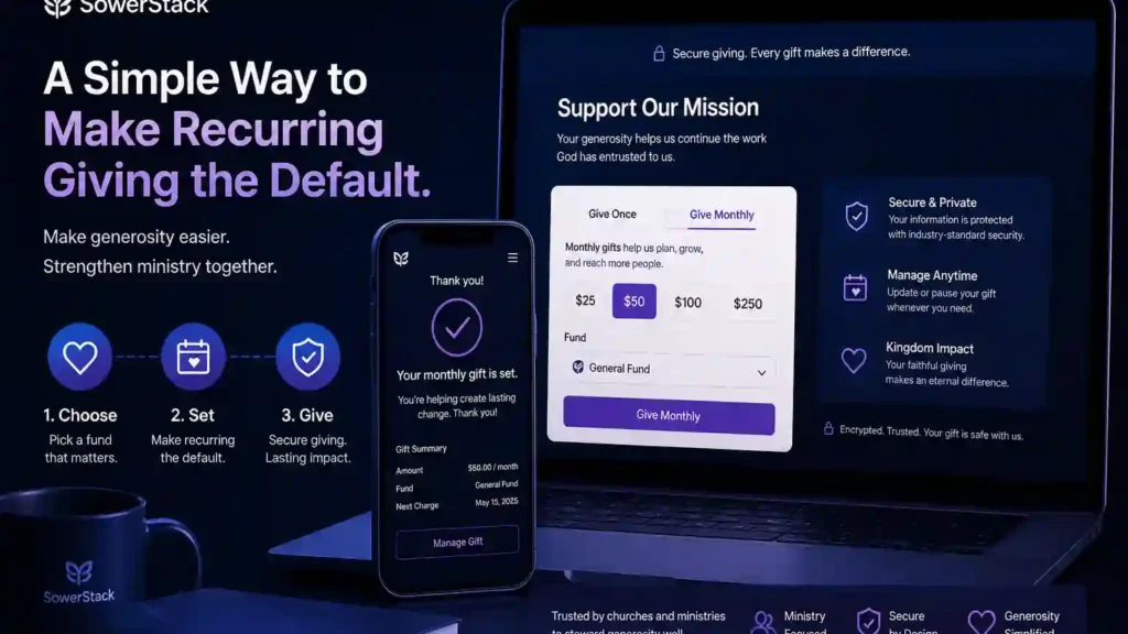
Your church’s giving page has a default too. On most platforms, when someone opens the giving form, the frequency is set to “One-Time.” That means every person who visits your giving page sees one-time giving as the recommended, normal, expected behaviour. Recurring giving is there, but it’s the thing you have to go out of your way to select.
That default is shaping your giving patterns right now. Not because your people don’t want to give regularly. Because the form is quietly telling them that one-time is the standard choice.
What changes when you flip the default
When recurring giving is the default selection on your giving page, the form communicates something different. It says: most people here give on a recurring basis. Regular, consistent generosity is the norm in this community. You’re welcome to change it to one-time if that’s what you prefer, but the expected rhythm is ongoing.
That’s a subtle shift in language. It’s not a subtle shift in outcome.
Churches that have moved recurring giving to the default position on their giving forms consistently report higher adoption rates for recurring gifts. Not because anyone was pressured. Not because the one-time option was removed. Simply because the default changed, and most people accepted the default.
Think about what this means for a church of 100 regular attenders. If 30 people give online and only 5 of them are on recurring gifts, your giving is volatile. It rises and falls with attendance, weather, holidays, and the summer travel season. If that same church flips the default and, over the next three months, moves from 5 recurring givers to 15, the financial foundation shifts. Fifteen families giving consistently regardless of whether they’re in the building on Sunday creates a baseline that doesn’t evaporate in July.
That stability isn’t just a financial convenience. It changes how you lead. When you can count on a predictable baseline, you make different decisions about ministry initiatives, building maintenance, staff needs, and benevolence. You plan from confidence instead of anxiety. That’s stewardship at the leadership level.
How to set this up in tithe.ly
If your church uses Tithe.ly (affiliate link) for online giving, changing the default from one-time to recurring is straightforward. The platform gives you control over how your giving form appears to donors, including which frequency option is pre-selected when someone opens the page.
Here’s how to do it:
That’s it. The whole process takes two to three minutes.
After you save, pull up your giving page on your phone and verify that “Monthly” (or whatever frequency you chose) is the pre-selected option when the page loads. Make sure the one-time option is still visible and easy to select for anyone who prefers it. You’re changing the default, not removing the choice.
One important detail: make sure all the frequency options are still available. Some churches, in an effort to simplify, disable certain frequencies. Keep weekly, biweekly, and monthly active. Different households have different pay schedules, and the easier you make it for someone to match their giving to their income cycle, the more likely they are to stick with it.
Why this isn’t manipulation
Some church leaders hesitate here. It can feel like you’re tricking people into recurring giving. That concern comes from a good place, and it deserves a straight answer.
You’re not hiding anything. The giver sees all the options clearly. One-time, weekly, biweekly, monthly. They can select any of them with a single tap. The only thing you’ve changed is which option is highlighted when the page first loads.
Consider the alternative. Right now, with one-time as the default, you’re already influencing behaviour. You’re just influencing it toward inconsistency. The form is already making a recommendation. The question isn’t whether your giving page should have a default. It will always have one. The question is whether that default serves your congregation’s desire to give faithfully and consistently, or whether it works against it.
Most of the people in your church who give online would choose recurring giving if the decision were framed differently. Many of them already give every week or every month through a repeated act of willpower. They open the app, enter the amount, and submit it. Every single time. Recurring giving simply automates a decision they’ve already made. Setting it as the default just makes that automation the path of least resistance instead of an extra step.
That’s not manipulation. That’s good design in service of your people’s existing generosity.
The compounding effect over time
The first month after you change the default, you might not notice much. A few more people will set up recurring gifts than usual. The difference will feel modest.
Give it three months.
By then, the cumulative effect starts to show. Every new giver who visits your page for the first time encounters recurring as the default. Some of them accept it. Those gifts continue month after month without any additional effort from the giver or from you. Each month, a few more people set up recurring gifts. Each month, the baseline grows.
After six months, the difference between a church that defaults to one-time and a church that defaults to recurring becomes pronounced. The recurring-default church has a growing floor of predictable giving. The one-time-default church is still riding the weekly roller coaster.
This compounds over years. A recurring gift set up in March continues through the summer, through the holidays, through the seasons when attendance dips and one-time giving follows it down. The giver doesn’t have to remember. The gift doesn’t depend on whether they’re in town. The church doesn’t have to re-earn that gift every seven days.
Compounding faithfulness. That’s what a default setting produces when it’s pointed in the right direction.
Other default settings worth checking
While you’re in your giving platform settings, there are a few other defaults worth reviewing.
Pre-set giving amounts. Many platforms let you display suggested gift amounts on the giving form. If yours does, make sure the amounts reflect your congregation realistically. A giving page that suggests $500, $1,000, and $5,000 communicates something very different than one that suggests $25, $50, and $100. The amounts should feel accessible, not aspirational. You want the first-time giver to see a number that feels like it was meant for someone like them.
Fund designation defaults. If your giving page shows multiple funds (general fund, building fund, missions, benevolence), check which one is selected by default. It should be your general fund. If a secondary fund is pre-selected, some givers will contribute to it unintentionally, and you’ll spend time sorting out designations after the fact.
Cover processing fees. Most platforms offer a checkbox that allows the giver to cover the transaction fee. If your platform lets you pre-check that box, consider doing so. Many givers are happy to cover the fee when the option is presented to them. Far fewer will seek it out on their own. The same default effect applies here: what’s pre-selected gets accepted more often.
Each of these is a small decision. Together, they shape the giving experience for every person who visits your page. And each one takes less than a minute to adjust.
Respecting the giver’s choice
Good defaults respect the person making the decision. They don’t lock anyone in. They don’t hide alternatives. They don’t create guilt.
Your giving page should always make it easy for someone to select one-time giving if that’s their preference. The button should be right there, clearly labelled, requiring no extra steps. The person who wants to make a single gift to your building campaign or give a special offering at Easter should be able to do that without feeling like they’re going against the grain.
The goal isn’t to pressure anyone into recurring giving. The goal is to make the giving page reflect what most faithful givers actually want: consistent, predictable generosity that doesn’t require a weekly decision.
When the default aligns with what people already intend, the form serves them. When the default works against what they intend, it creates unnecessary friction. Most of your regular givers already give consistently. The default should honour that consistency, not ignore it.
Five minutes, lasting impact
This is one of those changes that feels almost too small to matter. Logging into a dashboard, changing one dropdown, and clicking save. The whole process is less work than writing a Sunday announcement.
But defaults are one of the most powerful forces in human decision-making. They operate quietly, without drawing attention to themselves. They shape behaviour not through persuasion but through simple design. And they work whether you’re intentional about them or not.
Right now, your giving page has a default. It’s either working for your congregation’s generosity or it’s working against it. You didn’t choose the current default deliberately. Your giving platform’s software team chose it for you, probably years ago, probably without thinking about your church at all.
You can choose it deliberately now. Five minutes in your Tithe.ly (affiliate link) dashboard. One setting changed. And every person who visits your giving page from this point forward encounters a form that’s designed to support the kind of giving most of them already want to practice.
That’s not a trick. It’s not a growth hack. It’s a five-minute act of stewardship that quietly serves your church for years to come.