A family visits your church for the first time on a Sunday morning. The sermon connects. The worship feels genuine. They leave thinking they might come back. Two weeks later, they do. By the third visit, they feel at home. They want to give.
So they pull out their phone during the offering, tap your church’s website, and try to find the giving page.
They scroll past the sermon archive. Past the events calendar. Past the staff bios. They find a small link in the footer that says “Donate.” They tap it. A login screen appears. They don’t have an account. They tap “Create Account.” The page asks for a username, a password, and their mailing address before they can enter a dollar amount. By now, 45 seconds have passed and they’ve done more work than placing an online food order.
They close the browser. They’ll try again later.
Most of them won’t.
The problem isn’t generosity
Your people want to give. That’s not the issue. The issue is what happens between the moment they decide to give and the moment their gift actually goes through. Every extra step in that process costs you.
Not because people are lazy. Because they’re human. They’re giving during a sermon, or during lunch on Tuesday when they remember, or at 10 p.m. while paying bills. They have three minutes of willingness and your giving page demands seven minutes of effort.
This isn’t a technology problem. It’s a communication problem. Your giving page is saying something to your people, whether you designed it to or not. A buried, complicated page communicates that online giving is an afterthought. A clean, visible, simple page communicates that their generosity matters and that you’ve made it easy for them to act on it.
Most churches set up their giving page once and never revisit it. That’s understandable. You had a hundred other things to worry about that week. But the page you built in 2019 is quietly shaping every giving decision your people make in 2026.
It’s worth an afternoon of your time to fix it.
Too many clicks between decision and gift
Count the steps someone has to take to complete a gift on your page right now. Open your phone, go to your website, and try it yourself. Time it.
If it takes more than three taps from your homepage to a completed gift, you’re losing people at each step. The math is straightforward: every additional screen in a giving flow reduces completion rates. Payment processors have known this for years. The fewer decisions someone has to make between “I want to give” and “my gift is confirmed,” the more people finish the process.
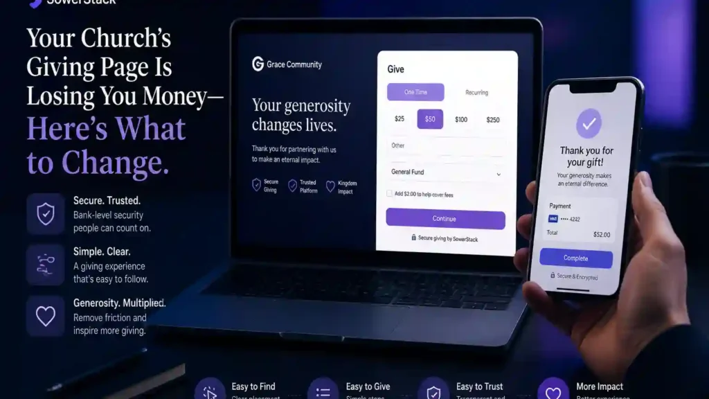
The fix is practical. Most modern giving platforms let you create a single-page giving form. No account creation required for first-time givers. No login screen before they can see the giving form. Name, amount, card number, done. If your current setup forces people through multiple pages, check your platform’s settings. Many churches are running a complicated flow because that was the default when they set it up, not because the platform requires it.
One page. One form. One confirmation. That’s what you’re after.
Your giving page doesn’t work on a phone
More than half of your congregation’s web traffic comes from mobile devices. For churches with a younger demographic, that number is closer to 70%. Pull up your giving page on your phone right now. Not your laptop. Your phone.
Does the form fit the screen without side-scrolling? Can you tap the input fields without zooming in? Does the “Give” button sit where a thumb can reach it? If you have to pinch and zoom to enter your card number, your mobile experience is broken.
This matters because of when people decide to give. It’s rarely at a desktop computer. It’s during the service, sitting in the pew. It’s Monday morning during a quiet moment. It’s after reading a text from a friend about something the church is doing in the community. In each of those moments, the device in their hand is a phone.
A giving page that works beautifully on desktop and poorly on mobile is a giving page optimized for the wrong moment. Most giving platforms built in the last five years are mobile-responsive by default. If yours isn’t, that’s a strong signal it’s time to look at what’s available now. The difference between a platform built for mobile and one retrofitted for it shows up in your giving numbers every single month.
Recurring giving is hidden
Here’s a pattern we see often: a church has a recurring giving option, but it’s a small checkbox buried below the fold of the giving form. You have to scroll past the amount field, past the payment details, past the “add a note” box, and there, in small text, sits a checkbox that says “Make this recurring.”
That checkbox placement is costing you more than almost any other design choice on the page.
Recurring giving is the single most valuable behavior your giving page can encourage. A person who sets up a $100 monthly recurring gift at the start of the year gives $1,200 by December. A person who intends to give $100 each month but has to manually do it each time will, on average, miss two to four months. That’s $200 to $400 in giving that simply doesn’t happen. Not because of unwillingness. Because of forgetfulness and friction.
The recurring option should be the default view, not a hidden checkbox. When someone lands on your giving form, “Monthly” should be pre-selected or at least visually equal to “One-Time” at the top of the form. Many giving platforms allow you to set this. If yours does, go change it today. The five minutes it takes to adjust that setting could represent thousands of dollars in annual giving.
You’re not manipulating anyone. You’re making the option visible. People who want to give once can still give once. But people who would choose recurring giving if they saw it clearly will actually see it clearly. That’s stewardship of your systems, not a marketing trick.
Nobody can find the page
Open your church website on your phone. Without scrolling, can you see a way to give? If the link to your giving page lives only in your footer navigation, or inside a dropdown menu labeled “Resources” or “Connect,” most visitors will never find it.
Think about what your main navigation communicates. It tells people what your church considers most important. If your nav bar shows “About,” “Sermons,” “Events,” and “Contact,” you’re telling visitors that those four things matter most. Giving didn’t make the list.
That’s not a moral failing. It just reflects the fact that when the website was built, someone made reasonable choices about what to include. But the result is a giving page that only the most committed, tech-comfortable members will ever find on their own.
The fix takes less than ten minutes. Add “Give” or “Giving” as a top-level navigation item. Not buried in a submenu. Right there in the main nav, visible on every page. Some churches add a small button in the header that says “Give” with a slightly different background color so it stands out. That’s effective without being aggressive.
You can also link to the giving page from your sermon pages, your weekly email, and your announcement slides. The principle is the same: put the door where people are already walking. Don’t make them search the building for it.
No suggested amounts
A blank amount field with a blinking cursor creates a small but real moment of friction. The giver has to decide not just whether to give, but how much. For someone who’s never given before, or who is giving for the first time at your church, that blank field produces hesitation.
Suggested amounts reduce that hesitation. When your giving form shows three or four pre-set options, like $25, $50, $100, and $250, with a “Custom” option alongside them, you’re doing two things. You’re normalizing a range. And you’re removing a decision from the process.
This isn’t about anchoring people to a higher number. It’s about helping first-time givers answer the question “what’s normal here?” without having to ask anyone. A new family doesn’t know if people at your church typically give $20 or $200. Suggested amounts answer that question quietly.
Most giving platforms support preset amounts in their form settings. Turn them on. Choose amounts that reflect your actual congregation. If your average gift is $75, presets of $25, $50, $100, and $250 are reasonable. If your average gift is $40, adjust downward. The goal is to reflect reality, not to push.
Keep “Custom Amount” visible and easy to select. You never want someone to feel pressured into a preset. You want someone who doesn’t know where to start to see a reasonable starting point.
People don’t know what their money does
Your giving page probably says something like “Thank you for your generous gift to First Community Church.” Maybe it includes a Bible verse about cheerful giving. Maybe it shows your church logo and a form.
What it probably doesn’t say is what the money does.
This is a missed opportunity. People give more consistently when they have a concrete picture of where their gift goes. Not a detailed financial report. A sentence or two. “Your giving supports our weekly community meals, our children’s ministry, and our building fund.” That’s enough.
The reason this works isn’t manipulation. It’s connection. When someone gives $50 and sees the words “community meals,” they’re not just moving money. They’re feeding someone. That connection between their gift and a specific outcome makes the next gift easier. And the one after that.
You can take this further without much effort. If your giving platform supports designated funds, let people choose where their gift goes. “General Fund,” “Missions,” “Building,” “Benevolence.” Not every church needs this. But if your congregation regularly asks “can I give specifically to the food pantry?” and you don’t have an easy way for them to do that, you’re creating friction where generosity already exists.
Even if you don’t offer designated funds, add two or three sentences above your giving form that describe where the money goes. Update it once a quarter. That small act of transparency builds trust that compounds across every gift, every month, for years.
What this adds up to
None of these fixes require a web developer. None of them require a new giving platform, though evaluating your platform against these criteria is worth your time. Most of them take less than an hour. Some take less than ten minutes.
But the cumulative effect is significant. A church of 150 people where 60 give regularly, with an average gift of $75, brings in roughly $4,500 per month in regular giving. If reducing friction increases your regular givers from 60 to 70, and recurring giving bumps the average monthly total up by even 15%, that’s an additional $7,000 to $10,000 per year. For a church operating on a tight budget, that’s a staff position. That’s a missions partnership. That’s six months of benevolence fund.
The giving page you set up years ago served you well. It got you started. But the people in your church are ready to be more generous than your current systems allow them to be. When you remove the friction between their willingness and their action, you’re not asking for more. You’re simply making it easier for them to do what they already want to do.
That’s not a technology upgrade. That’s faithful stewardship of the generosity God has already placed in your community.